A Company’s Next Step
For more than 15 years, Dafna Rolls and her team have been growing their clients’ sales pipelines with a methodology that combines deep research and tailored communication tactics. despite the fact that DRolls was already established and operating across three continents, we discovered that Dafna and the DRolls brand were synonymous. Tasked with the mission of helping the company move into a new growth phase, we concluded the need to evolve the brand beyond its founder.

“You know the thrill you feel when you book that crucial meeting? That’s the heart of the DRolls brand.”
Erin Kopelow, Strategy Lead, TEC


The Energy of Possibility
We focused on the emotions associated with securing that pivotal meeting: the excitement, the determination, the spark of what could be. These feelings became the driving force behind our creative process, shaping our brand promise, rallying cry, and visual direction.
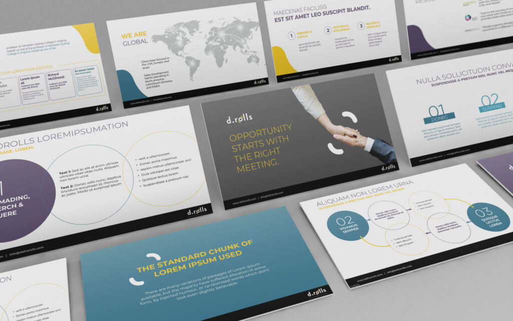
Visually, the circular design suggests a dynamic network, evoking both motion and connection. The warm color palette reflects the human warmth central to networking. The vibrant yellow highlights the spark of initial contact, emphasizing its potential for significant growth.


The Art of Showing
With 15 years of success under their belt, our next step with DRolls was helping them organize their success stories into a communication strategy that would confirm their brand’s position and earn new interest. This included crafting case studies and lead generation messaging.


