Strategic Narrative | Branding | Web
Thrive On
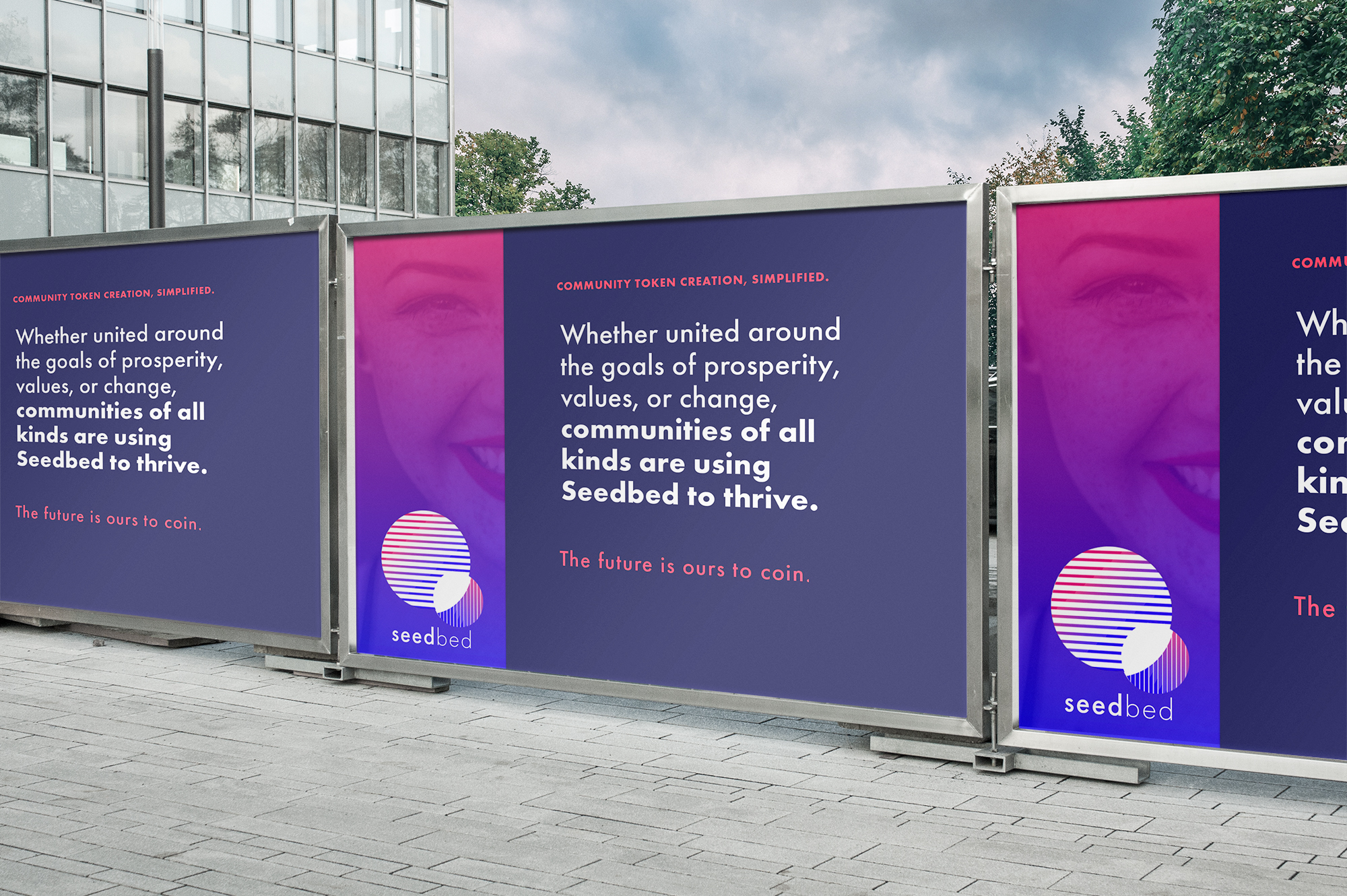
Seedbed wants to help communities function collectively by making it easier for them to pool assets to achieve shared goals. Their cryptocurrency platform facilitates the smooth and efficient exchange of time and expertise within and between communities.
This is a company that required branding that both compels and educates. Cryptocurrency itself is an unfamiliar, often confusing sector, and community currencies in particular represent a new step in the evolution of crypto.
When Seedbed approached us, we started with the story. What is broken? Why is Seedbed the solution? Our answer to both: cooperation.
– Strategic Narrative
– Branding & Logo Design
– Website
– Deck
The Narrative
Cooperation was our evolutionary leap, the great shift that made us great. Cooperation brought us through ice, plague, and scarcity. Compared to all other lifeforms, the ability to come together and unite diverse strengths to achieve shared goals has been our lifeline, compensating for individual weaknesses so the whole of humanity could thrive.
Our economic systems, however, were not designed to let collective cooperation reign. Furthermore, while almost every sector of modern society has been rapidly evolving in the digital age, financial and economic institutions have not. The result: entrenched mono-currency systems that benefit the few, often at the expense of the many.
It should be easier for every community to pool collective assets to achieve shared goals. Seedbed’s cryptocurrency platform facilitates the easy and effective exchange of time and expertise within and between communities. The time has come for an economic infrastructure that helps every community thrive.
Erin Kopelow, Head of Narrative, TEC
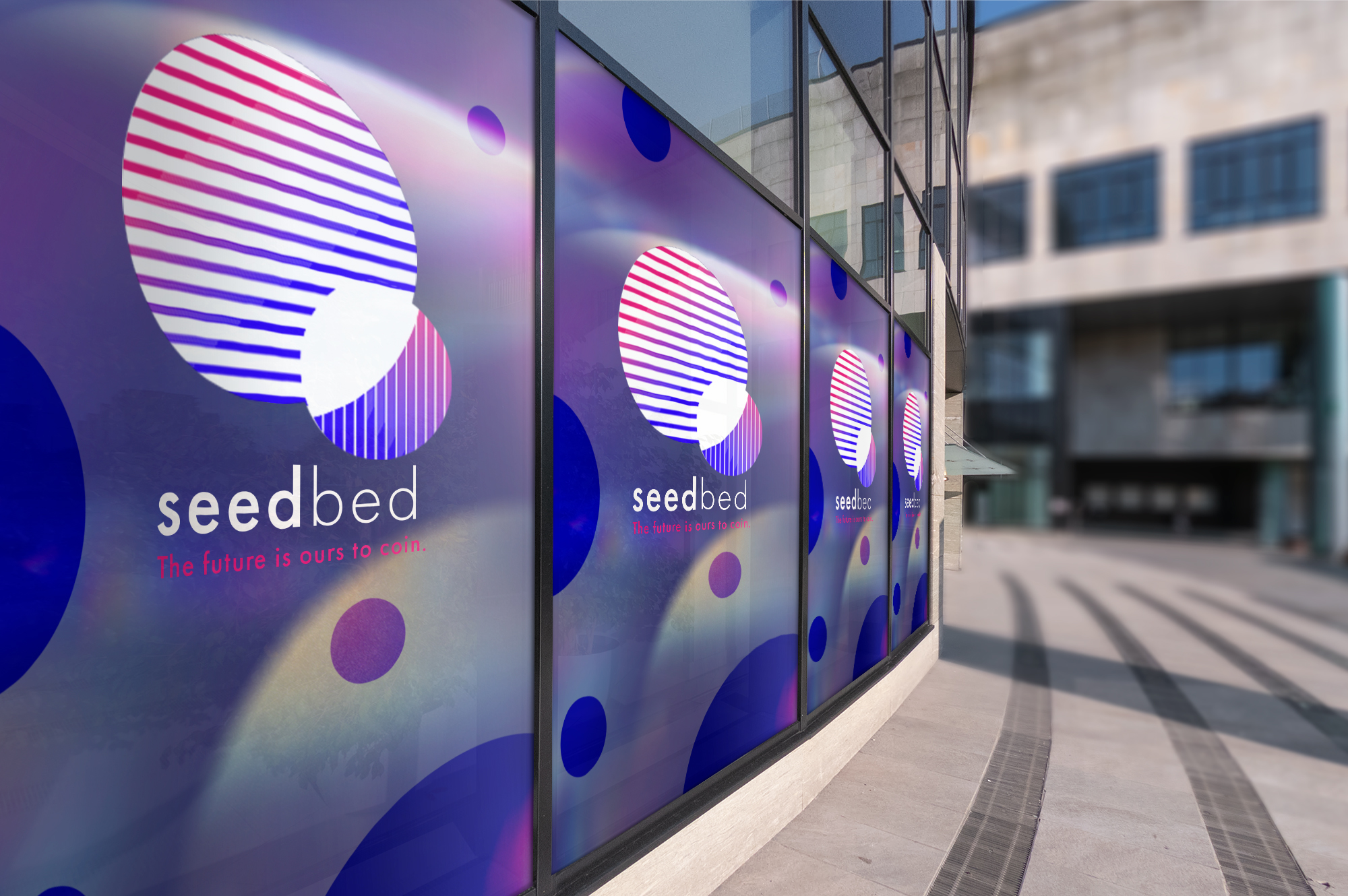
Visual Language
Seedbed’s brand needed to encompass the epic size of their groundbreaking undertaking, and to inspire at once the confidence and stability of a trusted financial institution and the youthful optimism of a revolutionary idea promising hope, light, and freedom.
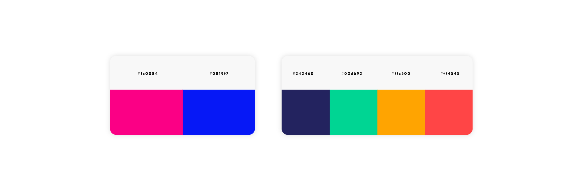
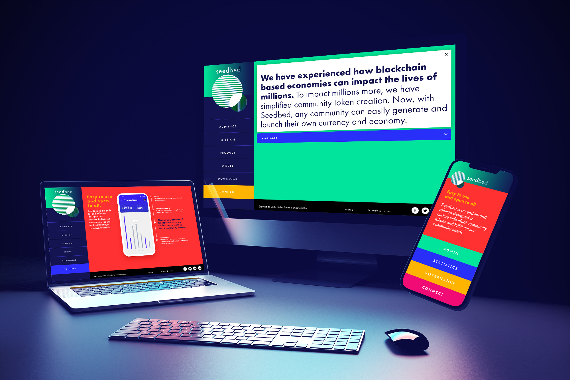
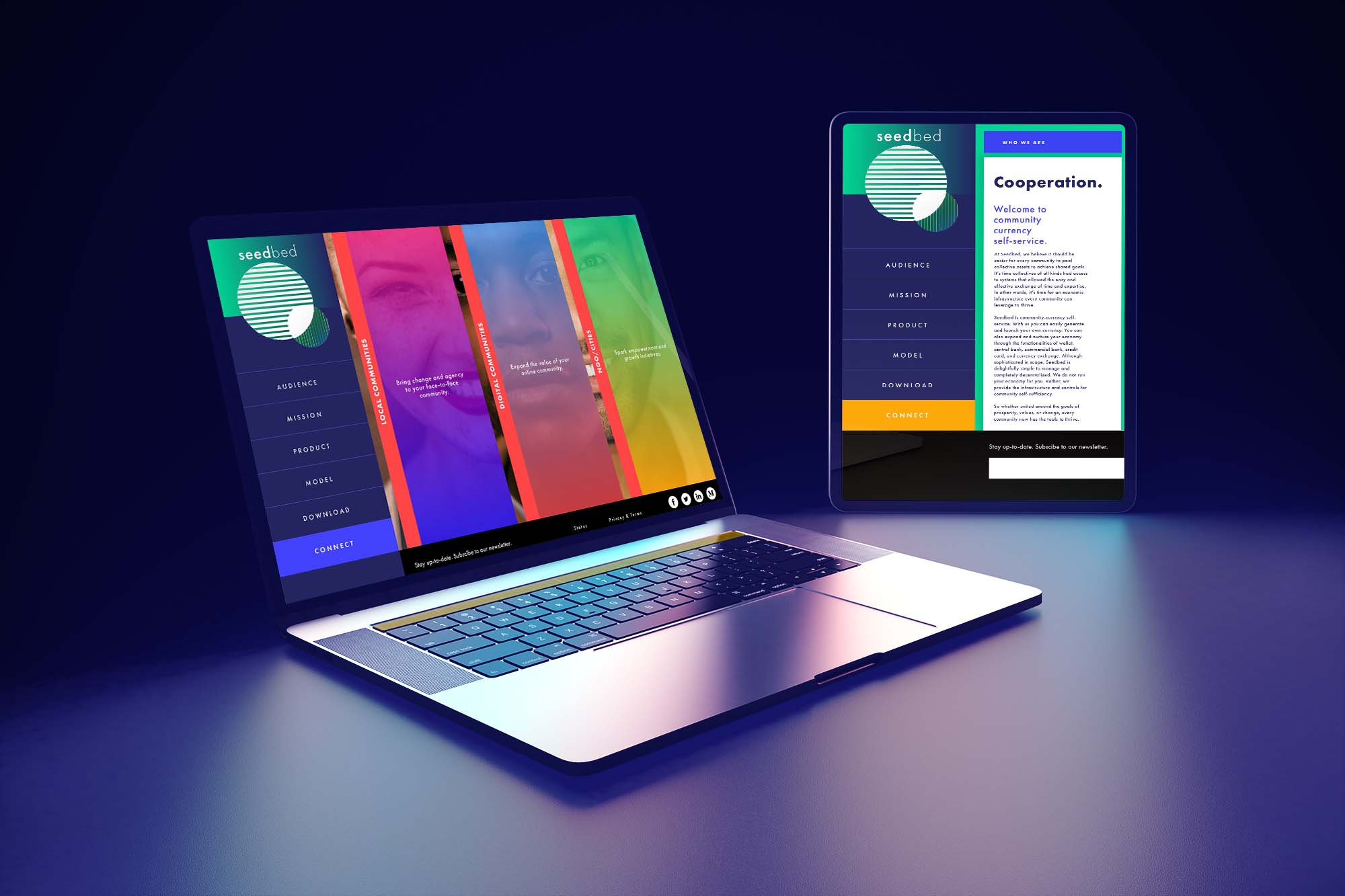
The visual language is bright, colorful, and easy to navigate, facilitating a simple, straightforward, and intuitive user experience. The bold, dark blue recalls trust and permanence, while the brighter hues help us envision the full spectrum of possibilities. The colors blend seamlessly into one another, emphasizing smooth transitions and limitlessness. Fonts and shapes are all rounded, clean, and clear.
The website design took these sentiments one step further by providing a visitor experience of a single, continuous page. With access to everything on one screen, the visitor follows a clear, guided path to understanding the product and platform, like a story that unfolds.
Tomi Nelkin, Creative Director, TEC
Learn how our Go-To-Marketing packages can support your companies strategic and ongoing needs.
CONTACT US

